


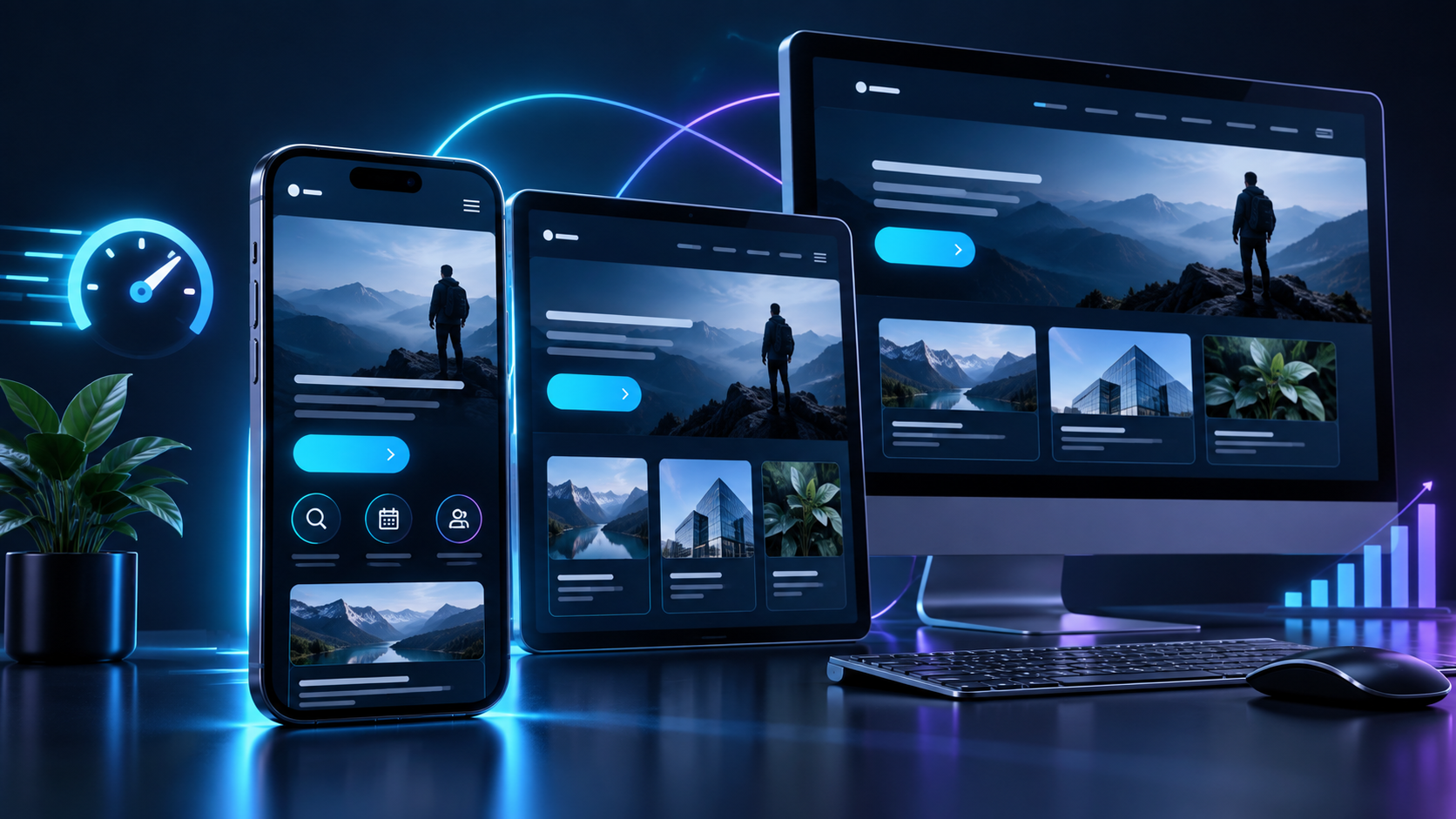
Mobile-First Isn't Optional Anymore: Is Your Website Ready?
Somewhere along the way, “mobile-friendly” became the bare minimum, not the standard to aim for. The businesses winning online today design for mobile first and treat desktop as the secondary experience, because that is how the traffic actually behaves.
The Traffic Has Already Shifted
- Mobile is the majority: mobile devices now account for roughly 59–60% of all global web traffic.
- But mobile converts worse: mobile landing pages often convert at noticeably lower rates than desktop, a gap frequently linked to slower load times and cramped design rather than lack of interest.
- Speed compounds the problem: mobile pages tend to load meaningfully slower than their desktop equivalents, which directly feeds the conversion gap.
Mobile-Friendly vs Mobile-First: The Real Difference
A mobile-friendly site is a desktop design that has been squeezed to fit a smaller screen. A mobile-first site is designed for the smaller screen from the very first decision, and desktop is the version that gets expanded from there.
The difference shows up in tap target sizes, image weight, form length, and how much scrolling a visitor has to do to find the call to action.
Common Mobile Mistakes Worth Auditing
- Buttons and links placed too close together for a thumb to tap accurately.
- Large, unoptimized images that slow load time specifically on mobile networks.
- Pop-ups or banners that cover the entire screen with no obvious way to close them.
- Forms designed for a mouse and keyboard, not a thumb on a small keyboard.
Why This Also Affects Your SEO
Google indexes and ranks most websites based primarily on their mobile version, not desktop. A weak mobile experience does not just cost conversions directly; it can quietly cap your search visibility as well.
Final Thoughts
If most of your traffic arrives on a phone, your website's real first impression is whatever that phone experience delivers, not the polished desktop version your team reviews internally.
At Advantus, every website build starts on a mobile screen, not a widescreen monitor, because that is where the decision to stay or leave is actually being made.